Unearth
Visual Branding
Unearth, a homeware brand focused on low-impact, handmade ceramics, needed a visual rebrand that reflected both its sustainability mission and the character of its products. I developed a brand direction that emphasized natural materials, restraint, and simplicity, translating those qualities into a cohesive system across typography, color, and layout. The result was a visual identity that felt aligned with the product itself while remaining flexible across digital and print applications.
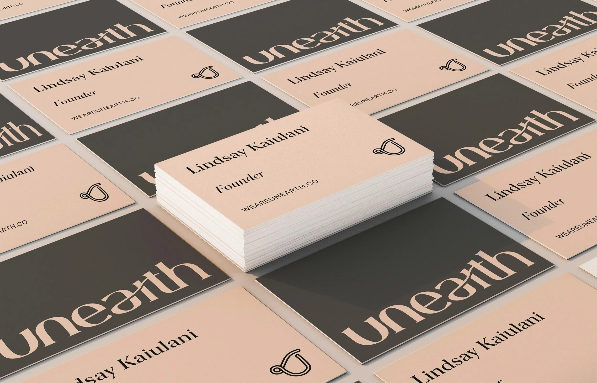
I explored a range of classic serif typefaces to develop a logo that reflects Unearth’s focus on simplicity and longevity. The final mark pairs a refined serif with a custom ligature and selectively removed details, creating a softer, more minimal feel while maintaining structure.
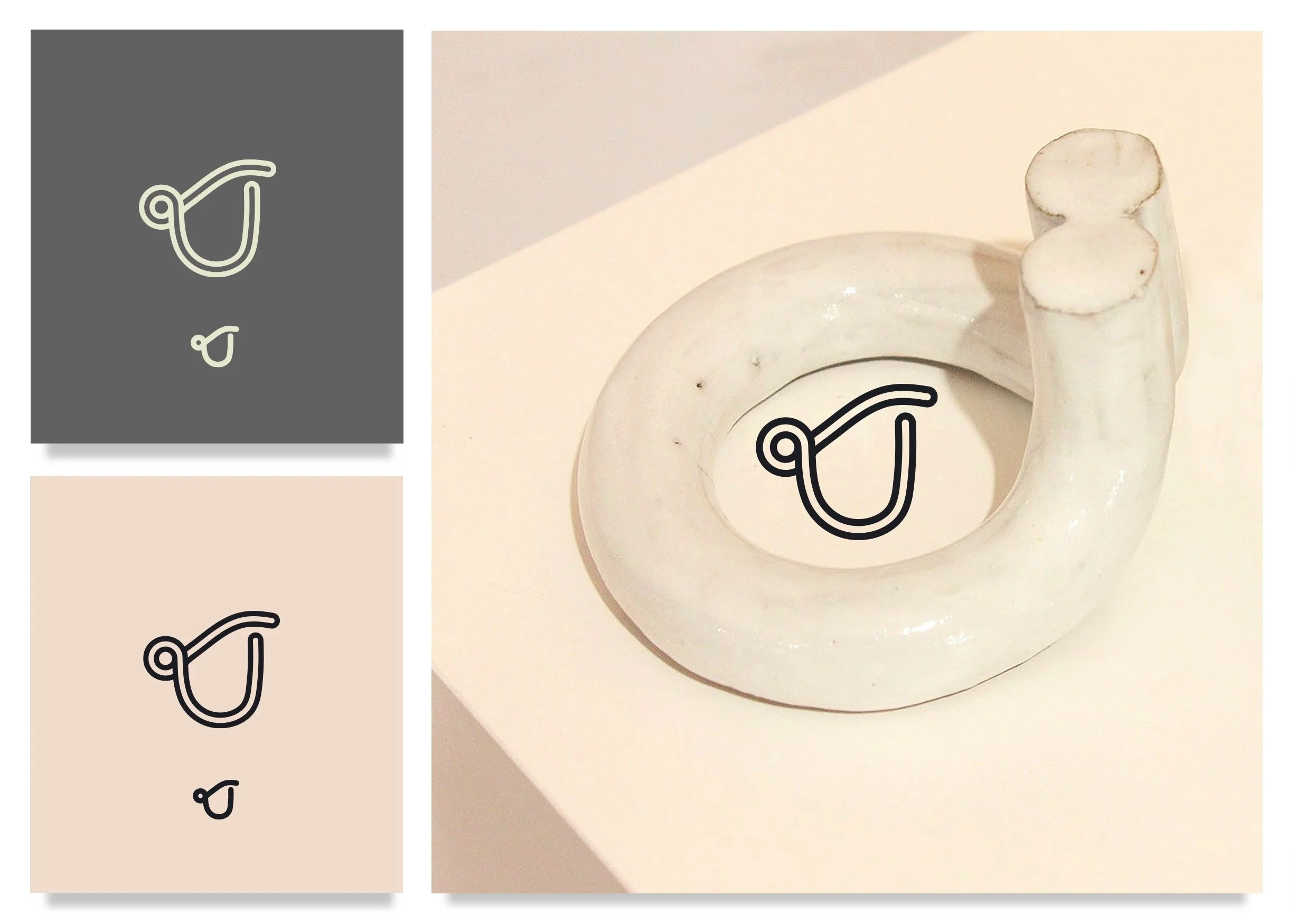
The logomark draws from the form of hand-coiled clay, referencing the brand’s process and materials. A simplified version was created to ensure clarity and legibility at smaller sizes across packaging and digital use.
Logo
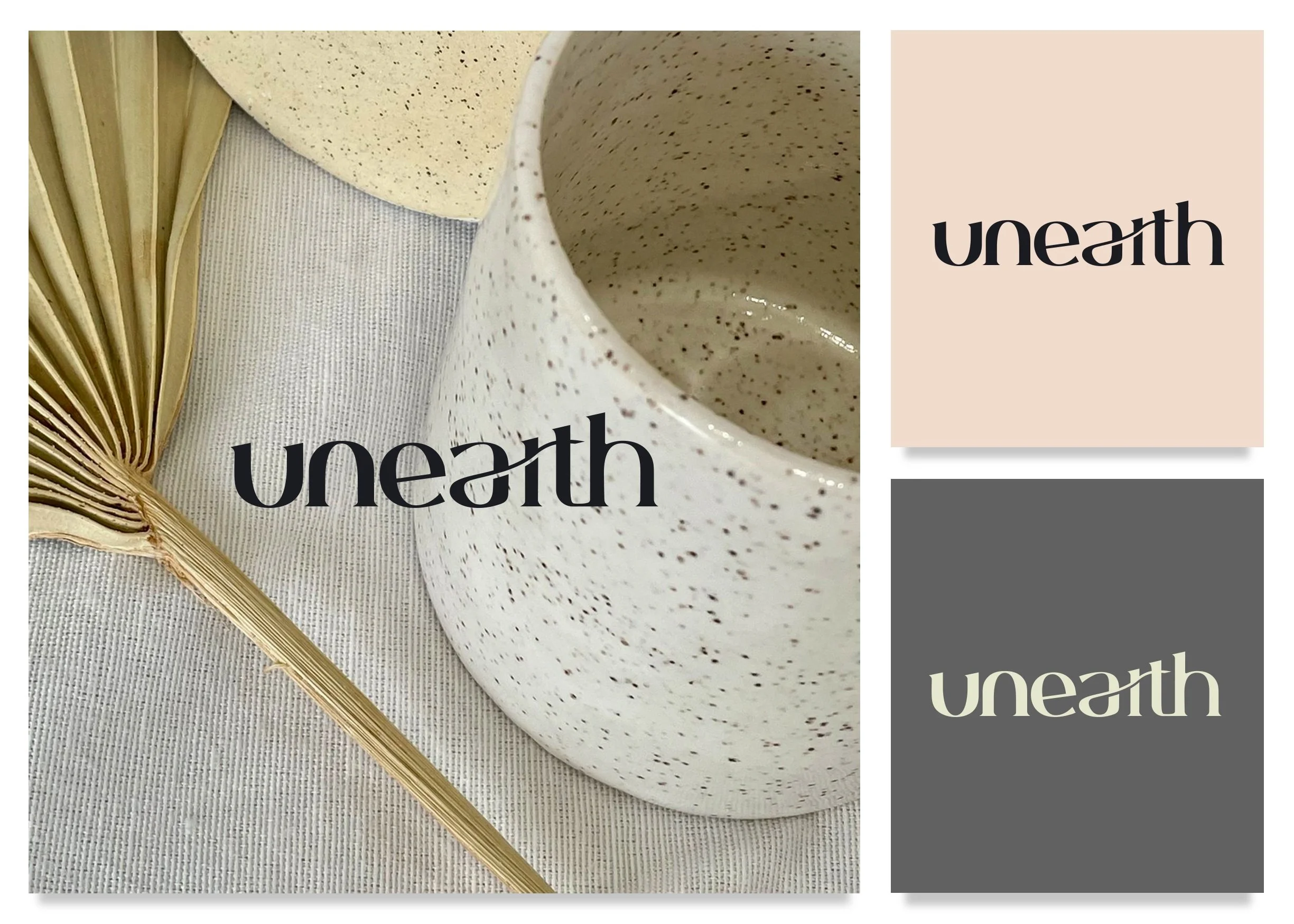
New York Regular anchors the brand with a sense of permanence, while a contemporary sans-serif introduces contrast and usability across digital applications.
Type Pairings
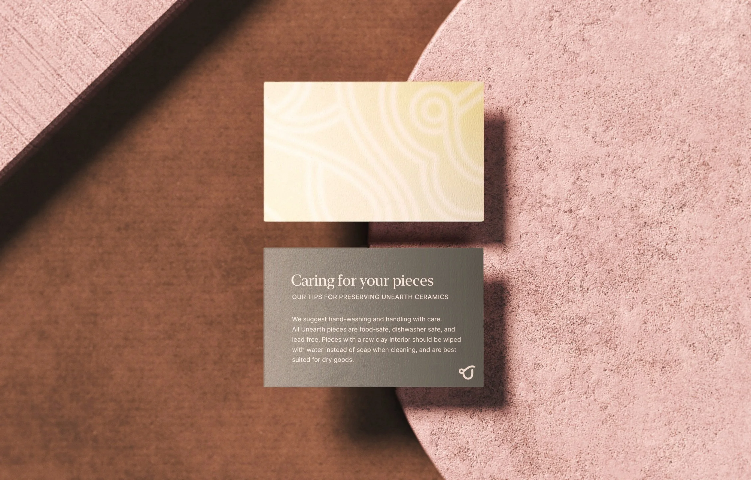
A neutral palette of stone and charcoal grounds the brand in its material roots. Peach introduces warmth and softness, while sage reinforces the sustainability narrative. Subtle gradients are used across packaging and print to add depth without disrupting the restrained system.
Color
The homepage is structured around clarity and intent, prioritizing sustainable living as the core message. Focused CTAs guide users toward key collections without overwhelming the experience.
Web Design

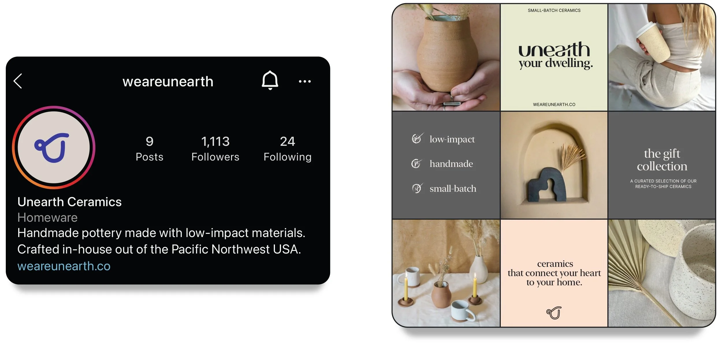
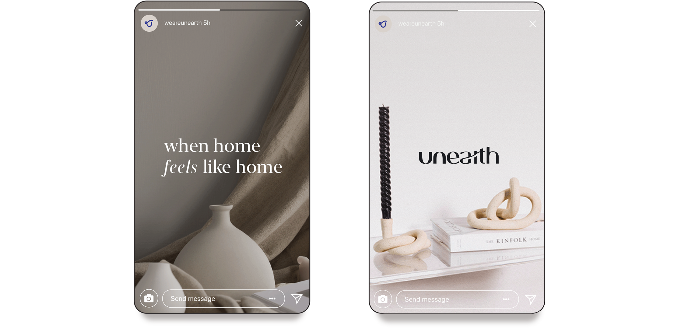
The social feed balances UGC with text-driven storytelling to establish a consistent voice. Ads remain minimal, using negative space and restrained layouts to stay aligned with the brand’s values.
Socials

Illustrative backgrounds, derived from the logomark, echo the brand’s hand-coiled forms and are applied across packaging and stationery as a flexible visual element.